前戏
某一天的夜里,敲完了代码之后便直接倒在床上睡着了,醒来时只记得梦里的一句话:“想要成为高手,就必须要大量实践,大量做项目,必须要把自己不会的东西全部吃透,不要得过且过。”,猛然想起是一位大神前辈对我说的,工作之后每天加班,回家之后就不想学习了,总想着一把锤子搞定所有钉子,这样是不行的,于是我就下了几百G的项目实战视频,有Vue、React、Node.js、Angular、Flutter、各个框架源码分析。。。我计划今年把它们全部干完,每做一个项目我都会写一篇博客来记录开发过程和收获,我想着通过大量的项目练习来让自己变成熟练工种,然后再去看源码就会比较轻松;接下来就让我牵着同学们的小手带你们开发一款基于uni-app的微信小程序项目,项目名字叫【懂你找图】。
项目介绍
做这个项目之前,同学们最好写过2-3个移动端的页面,有一定的JS基础,比如map,forEach函数的使用,Promise的使用,掌握Vue的基本语法,基本的生命周期,什么是Watch?怎么使用一个Component?子传父 / 父传子的实现方式。
没有基础的同学也不要担心,可以跟着把项目写完,然后把不理解的地方单独抽出来,逐个学习,然后再把项目独立做一遍就完事了。
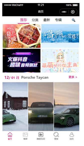
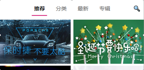
这个是项目做完之后的效果:
这个项目我会带领同学们写完首页的模块,其他模块由于API接口还没有写好,暂时不做,等以后写好了,我会马上更新,接下来我们就进入正片环节。
1.项目准备
1.1开发方式
uni-app为我们提供2种开发方式:
1.使用DCloud公司提供HBuilderX工具来快速开发;
2.使用脚手架来快速开发(我们这次项目使用此方式);
1.2脚手架搭建项目
1.全局安装,如果你以前安装过就不需要重复安装了。
2.创建项目。
vue create -p dcloudio/uni-preset-vue dnpicture
3.启动项目(微信小程序)。
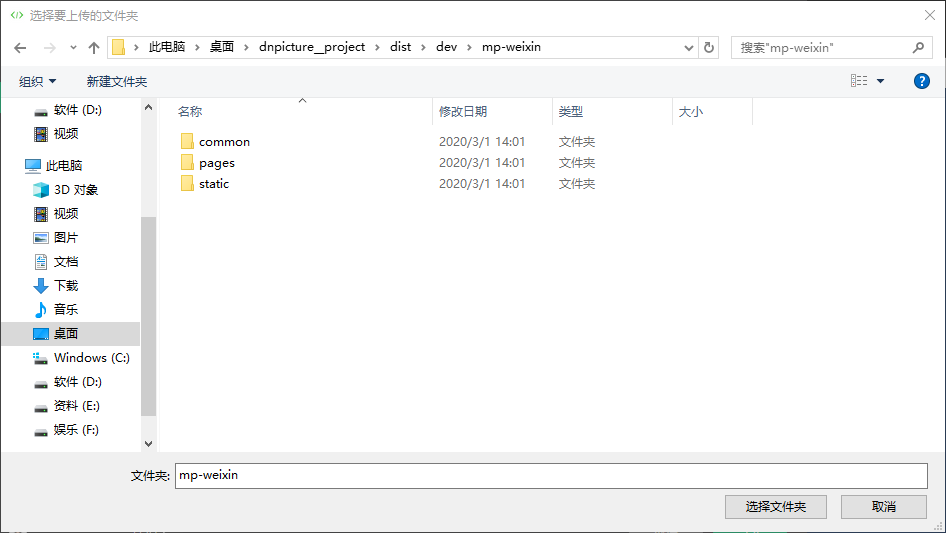
4.在微信小程序开发者工具导入项目。
注意导入项目的路径。
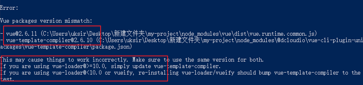
1.3搭建过程中可能遇到的问题
容易出现 vue 和 vue-template-complier版本不一致的问题。
根据提示重新安装对应的vue版本即可 npm install vue@2.6.10,然后再重新运行项目 npm run dev:mp-weixin。
1.4安装sass依赖
npm install sass-loader node-sass
2.项目搭建
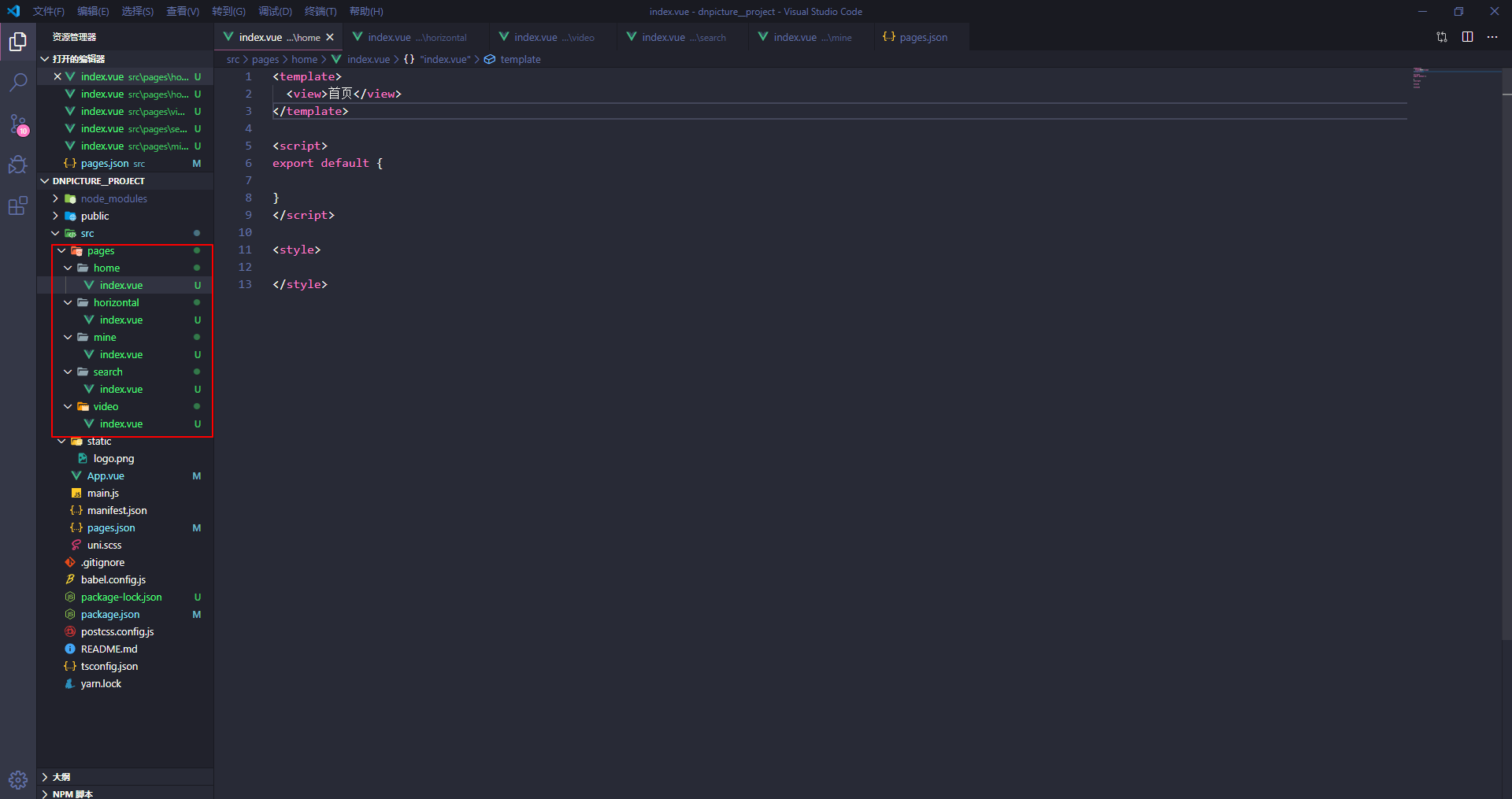
2.1新增tabbar页面
| 页面名称 |
路径 |
| 首页 |
home/index.vue |
| 横屏 |
horizontal/index.vue |
| 精美视频 |
video/index.vue |
| 搜索 |
search/index.vue |
| 我的 |
mine/index.vue |
新建完页面之后,我们再去pages.json文件里面添加页面路径和tabbar对应的图片和样式。
 
{
    "pages": [{
            "path": "pages/home/index",
            "style": {
                "navigationBarTitleText": "首页"
            }
        },
        {
            "path": "pages/horizontal/index",
            "style": {
                "navigationBarTitleText": "横屏"
            }
        },
        {
            "path": "pages/video/index",
            "style": {
                "navigationBarTitleText": "精美视频"
            }
        },
        {
            "path": "pages/search/index",
            "style": {
                "navigationBarTitleText": "搜索"
            }
        },
        {
            "path": "pages/mine/index",
            "style": {
                "navigationBarTitleText": "我的"
            }
        }
    ],
    "globalStyle": {
        "navigationBarTextStyle": "black",
        "navigationBarTitleText": "uni-app",
        "navigationBarBackgroundColor": "#F8F8F8",
        "backgroundColor": "#F8F8F8"
    },
    "tabBar": {
        "color": "#8a8a8a",
        "selectedColor": "#d4237a",
        "backgroundColor": "#fff",
        "position": "bottom",
        "borderStyle": "black",
        "list": [{
                "pagePath": "pages/home/index",
                "text": "首页",
                "iconPath": "./static/icon/_home.png",
                "selectedIconPath": "./static/icon/home.png"
            },
            {
                "pagePath": "pages/horizontal/index",
                "text": "横屏",
                "iconPath": "./static/icon/_img.png",
                "selectedIconPath": "./static/icon/img.png"
            },
            {
                "pagePath": "pages/video/index",
                "text": "精美视频",
                "iconPath": "./static/icon/_videocamera.png",
                "selectedIconPath": "./static/icon/videocamera.png"
            },
            {
                "pagePath": "pages/search/index",
                "text": "搜索",
                "iconPath": "./static/icon/_search.png",
                "selectedIconPath": "./static/icon/search.png"
            },
            {
                "pagePath": "pages/mine/index",
                "text": "我的",
                "iconPath": "./static/icon/_my.png",
                "selectedIconPath": "./static/icon/my.png"
            }
        ]
    }

}
pages.json接下来我们需要在App.vue中全局引入字体图标文件。
<script>
    export default {
        onLaunch: function() {
        },
        onShow: function() {
        },
        onHide: function() {
        }
    }
</script>

<style>
    @import "./styles/iconfont.wxss";
    @import "./styles/base.wxss";
</style>
App.vue
引入成功之后,就可以看到如下效果啦。
注意:要记得把icon和styles文件夹放到项目中去哦。
styles文件加放到和App.vue同层级目录下,icon文件夹放入static文件夹里面。
2.2 uni-ui介绍
文档: https://uniapp.dcloud.io/component/README?id=uniui
uni-ui是DCloud提供的一个跨端ui库,它是基于vue组件的、flex布局的、无dom的跨全端ui框架。
uni-ui不包括基础组件,它是基础组件的补充:
数字角标、日历、卡片、折叠面板、倒计时、抽屉、悬浮按钮、收藏按钮、底部购物导航、宫格、图标、索引列表、列表、加载更多、自定义导航栏、通告栏、数字输入框、分页器、弹出层、评分、搜索栏、分段器、步骤条、滑动操作、轮播图指示点、标签。
3.首页模块开发准备
3.1 功能分析
1.修改导航栏外观
2.使用分段器组件搭建子页面
3.封装自己的异步请求
3.2 搭建子页面
- 首页模块分为4个部分,分别是 推荐、分类、最新、专辑
新建自定义组件来代替上述的4个页面
- home-recommend
- home-category
- home-new
- home-album
3.2.1 分段器介绍
分段器是指uni-ui中的一个组件,其实就是俗称的标签页,tab栏(https://ext.dcloud.net.cn/plugin?id=54)
3.2.2 分段器使用
<template>
  <view>
    <view>
      <uni-segmented-control
        :current="current"
        :values="items.map(v=>v.title)"
        @clickItem="onClickItem"
        style-type="text"
        active-color="#d21974"
      ></uni-segmented-control>
      <view class="content">
        <view v-if="current === 0">
        </view>
        <view v-if="current === 1">
        </view>
        <view v-if="current === 2">
        </view>
        <view v-if="current === 3">
        </view>
      </view>
    </view>
  </view>
</template>

<script>
import { uniSegmentedControl } from "@dcloudio/uni-ui";
export default {
  components: {
    uniSegmentedControl
  },
  data() {
    return {
      items: [
        { title: "推荐" },
        { title: "分类" },
        { title: "最新" },
        { title: "专辑" }
      ],
      current: 0
    };
  },
  methods: {
    onClickItem(e) {
      if (this.current !== e.currentIndex) {
        this.current = e.currentIndex;
      }
    }
  }
};
</script>

<style lang="scss">

</style>
分段器的使用
3.3 封装自己的异步请求
为什么要封装?
- 原生的请求不支持promise;
- uni-api的请求不能够方便的添加请求中效果;
- uni-api的请求返回值是个数组,不方便取值;
封装的思路
- 基于原生promise来封装;
- 挂载到Vue的原型上;
- 通过this.request的方式来使用;
/*
  基于原生promise封装request
  发请求之前显示'加载中...'
  请求完成之后隐藏'加载中...'
*/

export default (params) => {
  uni.showLoading({
    title: '加载中'
  });
  return new Promise((resolve, reject)=>{
    wx.request({
      ...params,
      success(res) {
        resolve(res.data);
      },
      fail(err) {
        reject(err);
      },
      complete(){
        uni.hideLoading();
      }
    })
  })
}
request
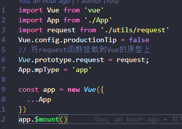
在main.js里面将request函数挂载到Vue的原型上
4.首页-推荐模块开发
4.1 功能介绍
- 数据动态渲染;
- moment.js的使用;
- 基于scroll-view的分页加载;
4.2 实现过程
首页推荐这个页面非常简单,没有任何技术含量。。。
首先我们把静态页面写出来,然后发送请求获取数据然后使用v-for指令循环渲染数据,渲染图片的时候注意接口有没有带rule这个属性,如果有需要把thumb属性和rule进行拼接,这里约定好<Height>的值为300,然后注意一下图像要使用widthFix还是aspectFill,这些都是非常基础的知识,大家可以自行到微信小程序的官方开发文档里面找到,如果你不懂,还不愿意自己去找资料学习,那我也没办法啦。
日期部分使用的是moment.js库,下面是他的文档地址:
http://momentjs.cn/docs/#/displaying/
接下来说一说分页,无非就是把最顶级的view 标签改成scroll-view标签,加上一个scroll-y属性,再加上一个触底事件@scrolltolower=“handleScrollToLower”即可,这些东西uni-app官网都有,由于这个项目是使用uni-app来开发,所以很多API和组件都需要在uni-app文档和微信小程序的文档穿插查找,搞技术嘛,就是要往上面砸时间,耐心点就完事了。
分页部分的逻辑其实很简单:
页面触底之后,发送请求获取数据,skip的值等于自身加上limit的值,然后limit的值加上30条,需要注意的是在触底之后发送请求之前要判断是否还有新的limit数据,可以在data里面设置一个状态,比如hasLimit:true,然后在请求函数里面判断一下是否还有新数据返回,如果没有的话就将hasLimit的值改为false并且提示用户。
<template>
  <scroll-view
    scroll-y
    @scrolltolower="handleScrollToLower"
    class="container"
    v-if="recommentList.length!==0"
  >
    <!-- 推荐部分图片 start -->
    <view class="recomment-wrap">
      <view class="item" v-for="item in recommentList" :key="item.id">
        <image :src="item.thumb" mode="widthFix" />
      </view>
    </view>
    <!-- 推荐部分图片 end -->

    <!-- 月份图片部分 start -->
    <view class="month-wrap">
      <view class="month-title">
        <view class="month-info">
          <view class="month-time">
            <text class="day">{{monthList.day}} /</text>
            <text class="month">{{monthList.month}} 月</text>
          </view>
          <view class="month-text">{{monthList.title}}</view>
        </view>
        <view class="month-more">更多></view>
      </view>
      <view class="month-content">
        <view class="item" v-for="item in monthList.items" :key="item.id">
          <image :src="item.thumb + item.rule.replace('$<Height>',300)" mode="aspectFill" />
        </view>
      </view>
    </view>
    <!-- 月份图片部分 end -->

    <!-- 热门部分 start -->
    <view class="hot-wrap">
      <view class="hot-title">
        <text class="title-text">热门</text>
      </view>
      <view class="hot-content">
        <view class="hot-item" v-for="item in hotList" :key="item.id">
          <image :src="item.thumb" mode="widthFix" />
        </view>
      </view>
    </view>
    <!-- 热门部分 end -->
  </scroll-view>
</template>

<script>
export default {
  data() {
    return {
      params: {
        limit: 30,
        order: "hot",
        skip: 0
      },
      recommentList: [],
      monthList: [],
      hotList: [],
      hasLimit: true
    };
  },
  mounted() {
    this.getList();
  },
  methods: {
    getList() {
      this.request({
        url: "http://157.122.54.189:9088/image/v3/homepage/vertical",
        data: this.params
      }).then(data => {
        if (this.monthList.length === 0) {
          this.recommentList = data.res.homepage[1].items;
          this.monthList = data.res.homepage[2];
          this.monthList.day = this.moment(this.monthList.stime).format("DD");
          this.monthList.month = this.moment(this.monthList.stime).format("MM");
        }
        if (data.res.vertical.length === 0) {
          this.hasLimit = false;
          uni.showToast({
            title: "没有更多数据啦",
            icon: "none"
          });
          return;
        }
        this.hotList = [...this.hotList, ...data.res.vertical];
        this.params.skip += this.params.limit;
        this.params.limit += 30;
      });
    },
    handleScrollToLower() {
      if (this.hasLimit) {
        this.getList();
      } else {
        uni.showToast({
          title: "没有更多数据啦",
          icon: "none"
        });
      }
    }
  }
};
</script>

<style lang="scss">
.container {
  height: calc(100vh - 35px);
}
/* 推荐图片部分*/
.recomment-wrap {
  display: flex;
  flex-wrap: wrap;
  > .item {
    width: 50%;
    image {
      border: 3rpx solid #fff;
    }
  }
}

/* 月份图片部分 */
.month-wrap {
  .month-title {
    display: flex;
    justify-content: space-between;
    padding: 20rpx 20rpx;
    .month-info {
      display: flex;
      font-weight: bold;
      .month-time {
        color: $color;
        .day {
          font-size: 32rpx;
        }

        .month {
          font-size: 26rpx;
        }
      }

      .month-text {
        margin-left: 20rpx;
        color: #666;
        font-size: 32rpx;
      }
    }

    .month-more {
      font-size: 28rpx;
      color: $color;
    }
  }

  .month-content {
    display: flex;
    flex-wrap: wrap;
    .item {
      width: 33.33%;
      image {
        border: 5rpx solid #fff;
      }
    }
  }
}

/* 热门部分 */
.hot-wrap {
  .hot-title {
    padding: 20rpx;
    text.title-text {
      padding-left: 14rpx;
      color: $color;
      border-left: 10rpx solid $color;
      font-size: 28rpx;
      font-weight: bold;
    }
  }

  .hot-content {
    display: flex;
    flex-wrap: wrap;
    .hot-item {
      width: 33.33%;
      image {
        border: 5rpx solid #fff;
      }
    }
  }
}
</style>
首页推荐组件代码后续还要加上跳转功能,到时候会将跳转抽离成一个公共组件,到时在下文补充。
5.首页-专辑模块开发
5.1 功能介绍
- swiper轮播图部分
- 专辑列表部分
5.2 实现过程
轮播图的部分直接使用微信小程序官方提供的swiper组件,注意swiper组件默认宽度100%,高度是150px,而且swiper必须和swiper-item配对出现,否则会出问题,下面是小程序基础教程和官方文档:
基础教程:https://www.cnblogs.com/replaceroot/p/11262929.html
官方文档:https://developers.weixin.qq.com/miniprogram/dev/component/swiper.html
搞定了轮播之后就很容易了,写一下静态页面,发下请求然后渲染数据,注意对分页数据的判断就行啦,对你们来说绝对是小菜一碟,代码如下:
<template>
  <scroll-view scroll-y="true" @scrolltolower="handleScrollToLower" class="album-wrap">
    <!-- 轮播图部分 start -->
    <swiper class="swiper" indicator-dots="true" autoplay="true" interval="3000" circular="true">
      <swiper-item v-for="item in banner" :key="item.id">
        <image :src="item.thumb" mode="widthFix" />
      </swiper-item>
    </swiper>
    <!-- 轮播图部分 end -->

    <!-- 专辑列表部分 start -->
    <view class="album-list">
      <navigator
        :url="`/pages/album/index?id=${item.id}`"
        class="album-item"
        v-for="item in album"
        :key="item.id"
      >
        <view class="album-image">
          <image :src="item.cover" mode="aspectFill" />
        </view>
        <view class="album-info">
          <view class="alubm-name ellipsis">{{item.name}}</view>
          <view class="alubm-desc ellipsis">{{item.desc}}</view>
          <view class="attention">
            <view class="attention-btn">+关注</view>
          </view>
        </view>
      </navigator>
    </view>
    <!-- 专辑列表部分 end -->

  </scroll-view>
</template>

<script>
export default {
  data() {
    return {
      banner: [],
      album: [],
      params: {
        limit: 30,
        skip: 0,
        order: "new"
      },
      hasLimit: true
    };
  },
  methods: {
    getList() {
      this.request({
        url: "http://157.122.54.189:9088/image/v1/wallpaper/album",
        data: this.params
      }).then(data => {
        if (this.album.length === 0) {
          this.banner = data.res.banner;
        }
        if (data.res.album.length === 0) {
          this.hasLimit = false;
          uni.showToast({
            title: "没有更多的数据啦!",
            icon: "none"
          });
          return;
        }
        this.album = [...this.album, ...data.res.album];
        this.params.skip += this.params.limit;
        this.params.limit += 30;
      });
    },
    handleScrollToLower() {
      if (this.hasLimit) {
        this.getList();
      } else {
        uni.showToast({
          title: "没有更多数据啦!",
          icon: "none"
        });
      }
    }
  },
  mounted() {
    this.getList();
  }
};
</script>

<style lang="scss">
/* 公共样式 */
.ellipsis {
  text-overflow: ellipsis;
  overflow: hidden;
  white-space: nowrap;
}

/* 专辑轮播图部分 */
.album-wrap {
  height: calc(100vh - 35px);
  .swiper {
    height: 320rpx;
    image {
    }
  }
}

/* 专辑列表部分 */
.album-list {
  padding: 10rpx;
  .album-item {
    display: flex;
    padding: 10rpx;
    border-bottom: 3rpx solid #d5d5d5;
    .album-image {
      flex: 1;
      image {
        width: 200rpx;
        height: 200rpx;
      }
    }

    .album-info {
      flex: 3;
      margin-left: 40rpx;
      overflow: hidden;
      .alubm-name {
        color: #000;
      }

      .alubm-desc {
        color: #666;
      }

      .attention {
        display: flex;
        justify-content: flex-end;
        margin-top: 10rpx;
        .attention-btn {
          padding: 0 5rpx;
          border: 3rpx solid $color;
          color: $color;
        }
      }
    }
  }
}
</style>
home-album
6.专辑详情模块开发
6.1 功能分析
- 头部背景图部分
- 专辑详情列表图片部分
6.2 实现过程
实现的过程也非常简单,首先放一张image图片当作背景图片,图片里面的文字都知道怎么做吧,直接用定位就完事了。
下面也是一样套路,先写静态页面,然后发请求,注意下图片的宽高,和mode模式就行了,具体的代码如下:
<template>
  <view class="album-detail-wrap">
    <!-- 专辑详情背景部分 start -->
    <view class="album-background">
      <image :src="album.cover" mode="widthFix" />
      <view class="album-info">
        <view class="album-name">{{album.name}}</view>
        <view class="attention">
          <view class="attention-btn">关注专辑</view>
        </view>
      </view>
    </view>
    <!-- 专辑详情背景部分 end -->

    <!-- 列表部分 start -->
    <view class="album-list">
      <view class="album-title">
        <view class="author">
          <image :src="album.user.avatar" mode="aspectFill" />
          <text class="author-name">{{album.user.name}}</text>
        </view>
        <text class="album-desc">{{album.desc}}</text>
      </view>
      <view class="album-content">
        <view class="alubm-item" v-for="item in wallpaper" :key="item.id">
          <image :src="item.thumb + item.rule.replace('$<Height>',300)" mode="aspectFill" />
        </view>
      </view>
    </view>
    <!-- 列表部分 end -->
  </view>
</template>

<script>
export default {
  data() {
    return {
      params: {
        limit: 30,
        skip: 0,
        order: "new",
        first: "1"
      },
      id: "",
      album: [],
      wallpaper: [],
      hasLimit: true
    };
  },
  methods: {
    getList() {
      if(this.album.length==0) {
        this.params.first = '1';
      }
      this.request({
        url: `http://157.122.54.189:9088/image/v1/wallpaper/album/${this.id}/wallpaper`,
        data: this.params
      }).then(data => {
        if(this.album.length === 0) {
          this.album = data.res.album;
        }
        if(data.res.wallpaper.length===0) {
          this.hasLimit = false;
          uni.showToast({
            title: '没有数据啦',
            icon: 'none'
          });
          return;
        }
        this.params.first = 0;
        this.wallpaper = [...this.wallpaper,...data.res.wallpaper];
        this.params.skip += this.params.limit;
        this.params.limit += 30;
      });
    }
  },
  onReachBottom() {
    if(this.hasLimit) {
      this.getList();
    }else {
      uni.showToast({
        title: '没有数据啦!',
        icon: 'none'
      });
    }
  },
  onLoad(options) {
    this.id = options.id;
    this.getList();
  }
};
</script>

<style lang="scss">
.album-detail-wrap {
  /* 专辑详情背景图部分 */
  .album-background {
    position: relative;
    image {
    }

    .album-info {
      position: absolute;
      bottom: 5%;
      display: flex;
      align-items: center;
      justify-content: space-between;
      width: 100%;
      padding: 0 20rpx;
      .album-name {
        color: #fff;
        font-size: 32rpx;
      }

      .attention {
        display: flex;
        justify-content: center;
        align-items: center;
        .attention-btn {
          padding: 10rpx 15rpx;
          background-color: $color;
          color: #fff;
          border-radius: 10rpx;
          font-size: 26rpx;
        }
      }
    }
  }

  /* 专辑详情列表部分 */
  .album-list {
    .album-title {
      padding: 10rpx;
      .author {
        display: flex;
        image {
          width: 60rpx;
          height: 60rpx;
        }

        text.author-name {
          line-height: 60rpx;
          margin-left: 5rpx;
          color: #000;
        }
      }

      text.album-desc {
        color: #666;
        font-size: 26rpx;
      }
    }

    .album-content {
      display: flex;
      flex-wrap: wrap;
      .alubm-item {
        width: 33.33%;
        image {
          height: 200rpx;
          border: 3rpx solid #fff;
        }
      }
    }
  }
}
</style>
album/index.vue最后有个小坑需要注意下,小程序里面的view标签不支持文本中的换行符,如果某些特殊场景中后台返回的文本里面包含换行符就直接使用text标签就完事了。
7.图片详情模块开发
7.1 功能分析
- 封装超链接组件
- 发送请求获取数据
- 使用moment.js处理特殊时间格式
- 封装手势滑动组件
- 调用API下载图片
7.2 实现过程
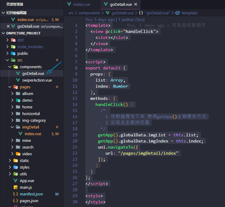
在components组件文件夹下面新建一个goDetail.vue的自定义组件
<template>
  <view @click="handleClick">
    <slot></slot>
  </view>
</template>

<script>
export default {
  props: {
    list: Array,
    index: Number
  },
  methods: {
    handleClick() {
      /*
        1 将数据缓存下来 使用getApp()全局缓存方式
        2 实现点击跳转页面
      */
     getApp().globalData.imgList = this.list;
     getApp().globalData.imgIndex = this.index;
     uni.navigateTo({
        url: "/pages/imgDetail/index"
     });
    }
  }
};
</script>

<style>
</style>
goDetail.vue
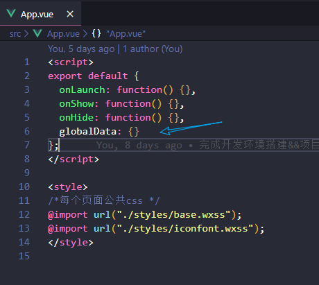
这个地方用到了微信小程序的全局缓存数据的方法,我们把数据缓存在App.vue文件中,使用的时候直接通过getApp().globalData.属性的方法获取数据即可。
具体发请求获取数据渲染页面的部分自行看代码学习吧。
项目github地址:https://github.com/C4az6/dnpicture.git
项目API文档:https://www.showdoc.cc/414855720281749?page_id=3678621017219602
这个项目教程就此结束。
来源:https://www.cnblogs.com/sauronblog/p/12389126.html |


 發表於 2020-3-14 10:30:00