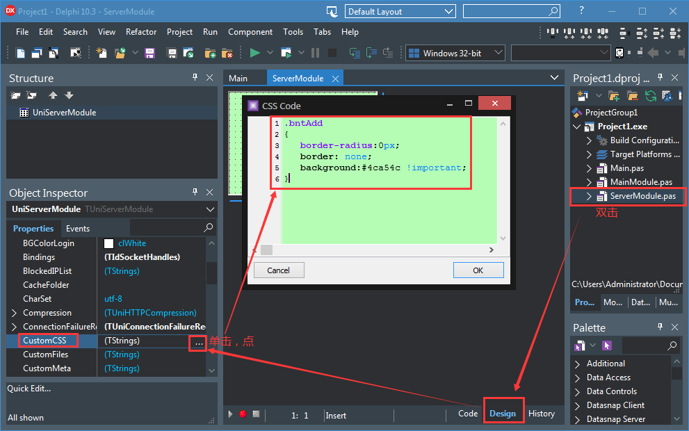
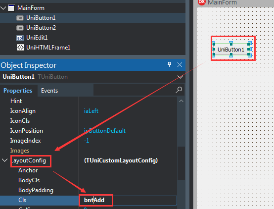
.bbtn-bt-blue,
.bbtn-bt-blue.x-btn-over {
background-color: #337ab7;
background-image: none;
border-color: #2e6da4;
border-radius: 4px;
}
.bbtn-bt-blue:hover,
.bbtn-bt-blue .x-btn-menu-active .x-btn-focus,
.bbtn-bt-blue.x-btn-focus {
background-color: #286090 !important;
border-color: #204d74 !important;
background-image: none !important;
outline: none!important;
}
.bbtn-bt-blue.x-btn-pressed {
background-color: #204d74 !important;
border-color: #122b40 !important;
background-image: none !important;
}
.bbtn-bt-blue:focus {
background-color: #286090;
border-color: #122b40
}
.bbtn-bt-green,
.bbtn-bt-green.x-btn-over {
background-color: #5cb85c;
background-image: none;
border-color: #4cae4c;
border-radius: 4px;
}
.bbtn-bt-green:hover,
.bbtn-bt-green .x-btn-menu-active .x-btn-focus,
.bbtn-bt-green.x-btn-focus {
background-color: #449d44 !important;
border-color: #398439 !important;
background-image: none !important;
outline: none!important;
}
.bbtn-bt-green.x-btn-pressed {
background-color: #398439 !important;
border-color: #255625 !important;
background-image: none !important;
}
.bbtn-bt-green:focus {
background-color: #449d44;
border-color: #255625
}
.bbtn-bt-cyan,
.bbtn-bt-cyan.x-btn-over {
background-color: #5bc0de;
background-image: none;
border-color: #46b8da;
border-radius: 4px;
}
.bbtn-bt-cyan:hover,
.bbtn-bt-cyan .x-btn-menu-active .x-btn-focus,
.bbtn-bt-cyan.x-btn-focus {
background-color: #31b0d5 !important;
border-color: #269abc !important;
background-image: none !important;
outline: none!important;
}
.bbtn-bt-cyan.x-btn-pressed {
background-color: #269abc !important;
border-color: #1b6d85 !important;
background-image: none !important;
}
.bbtn-bt-cyan:focus {
background-color: #31b0d5;
border-color: #1b6d85
}
.bbtn-bt-orange,
.bbtn-bt-orange.x-btn-over {
background-color: #f0ad4e;
background-image: none;
border-color: #eea236;
border-radius: 4px;
}
.bbtn-bt-orange:hover,
.bbtn-bt-orange .x-btn-menu-active .x-btn-focus,
.bbtn-bt-orange.x-btn-focus {
background-color: #ec971f !important;
border-color: #d58512 !important;
background-image: none !important;
outline: none!important;
}
.bbtn-bt-orange.x-btn-pressed {
background-color: #d58512 !important;
border-color: #985f0d !important;
background-image: none !important;
}
.bbtn-bt-orange:focus {
color: #fff;
background-color: #ec971f;
border-color: #985f0d
}
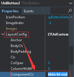
.bbtn-bt-red,
.bbtn-bt-red.x-btn-over {
background-color: #d9534f;
background-image: none;
border-color: #d43f3a;
border-radius: 4px;
}
.bbtn-bt-red:hover,
.bbtn-bt-red .x-btn-menu-active .x-btn-focus,
.bbtn-bt-red.x-btn-focus {
background-color: #c9302c !important;
border-color: #ac2925 !important;
background-image: none !important;
outline: none!important;
}
.bbtn-bt-red.x-btn-pressed {
background-color: #ac2925 !important;
border-color: #761c19 !important;
background-image: none !important;
}
.bbtn-bt-red:focus {
background-color: #c9302c;
border-color: #761c19;
outline: none!important;
}
.bbtn-bt-blue .x-btn-wrap,
.bbtn-bt-green .x-btn-wrap,
.bbtn-bt-cyan .x-btn-wrap,
.bbtn-bt-orange .x-btn-wrap,
.bbtn-bt-red .x-btn-wrap {
outline: none!important;
}
.bbtn-bt-blue .x-btn-inner,
.bbtn-bt-green .x-btn-inner,
.bbtn-bt-cyan .x-btn-inner,
.bbtn-bt-orange .x-btn-inner,
.bbtn-bt-red .x-btn-inner {
color: #FFF !important;
}


 發表於 2020-4-9 20:32:00