前言
为B站pink老师《黑马程序员pink老师前端入门视频教程 HTML5+CSS3+移动端布局-flex布局rem布局响应式布局摹客蓝湖使用-简单有趣好玩》视频教程学习笔记。
1.概述
HTML,全称Hyper Text Markup Language,即超文本链接语言
1.1 开发工具
测试使用vscode,官网下载安装即可,可以安装以下插件:
chinese
open in browser
auto rename tag
新建文件,保存为html格式,输入!,按下tab键,可以自动生成骨架代码:
<!--文档声明标签,告诉浏览器使用HTML5版本显示网页-->
<!DOCTYPE html>
<!--当前文档显示语言为中文-->
<html lang="zh-CN">
<head>
    <!--字符编码-->
    <meta charset="UTF-8">
    <meta name="viewport" content="width=device-width, initial-scale=1.0">
    <title>Document</title>
</head>
<body>

</body>
</html>
1.2 Emmet语法
Emmet语法的前身是Zen coding,它使用缩写来提高html/css编写速度,Vscode内部已集成该语法。
快速生成html结构
1.标签名+tab,快速生成标签
2.div*10+tab,快速生成多个标签
3.ul>li,快速生成父子标签
4.div+p,快速生成兄弟标签
5. .nav+tab/#nav+tab p.one+tab 快速生成类/id
6. .demo$*5+tab 生成有自增符号的类
7. div{hello} div{hello}*5 div{$}*5
快速生成CSS样式
tdn...
2.案例
摹写"学成在线"首页(p195-p220)
index.html
 
<!DOCTYPE html>
<html lang="zh-CN">
<head>
<meta charset="UTF-8">
<meta name="viewport" content="width=device-width, initial-scale=1.0">
<title>学成在线</title>
<link href="style.css" rel="stylesheet">
</head>
<body>
<!-- header -->
<div class="header w">
<!-- logo -->
<div class="logo"><img href="#" alt="logo"></div>
<!-- nav -->
<div class="nav">
<ul>
<li>
<a href="#">首页</a>
</li>
<li>
<a href="#">课程</a>
</li>
<li>
<a href="#">职业规划</a>
</li>
</ul>
</div>
<!-- search -->
<div class="search">
<input class="input" type="text" value="输入关键词"><input class="btn" type="button">
</div>
<!--user-->
<div class="user">
<a href="#"><img src="#" alt="avatar"></img><span>user-name</span></a>
</div>
</div>
<!-- banner -->
<div class="banner">
<!-- subbanner -->
<div class="subbanner w">
<div class="subnav">
<ul>
<li><a href="#">前端开发<span>></span></a></li>
<li><a href="#">后端开发<span>></span></a></li>
<li><a href="#">移动开发<span>></span></a></li>
<li><a href="#">人工智能<span>></span></a></li>
<li><a href="#">商业预测<span>></span></a></li>
<li><a href="#">云计算&大数据<span>></span></a></li>
<li><a href="#">运维&从测试<span>></span></a></li>
<li><a href="#">UI设计<span>></span></a></li>
<li><a href="#">产品<span>></span></a></li>
</div>
<div class="course">
<h2 class="course-title">我的课程表</h2>
<ul>
<li><h4>继续学习 程序语言设计</h4><p>正在学习-使用对象</p></li>
<li><h4>继续学习 程序语言设计</h4><p>正在学习-使用对象</p></li>
<li><h4>继续学习 程序语言设计</h4><p>正在学习-使用对象</p></li>
</ul>
<button>全部课程</button>
</div>
</div>
</div>
<!-- goods -->
<div class="goods w">
<div class="goods-left">
<h3>精品推荐</h3>
<ul>
<li><a href="#">JQuery</a></li>
<li><a href="#">Spark</a></li>
<li><a href="#">MySQL</a></li>
<li><a href="#">JavaWeb</a></li>
<li><a href="#">MySQL</a></li>
<li><a href="#">JavaWeb</a></li>
</ul>
</div>
<div class="goods-mod">
<a href="#">修改兴趣</a>
</div>
</div>
<!-- box -->
<div class="box w">
<div class="box-hd">
<h2>精品推荐</h2>
<a href="#">查看全部</a>
</div>
<div class="box-bd">
<ul>
<li>
<img src="#" alt="picture"/>
<h4>Think PHP 5.0 博客系统实战项目演练</h4>
<p><span>高级</span> • 1125人在学习</p>
</li>
<li>
<img src="#" alt="picture"/>
<h4>Think PHP 5.0 博客系统实战项目演练</h4>
<p><span>高级</span> • 1125人在学习</p>
</li>
<li>
<img src="#" alt="picture"/>
<h4>Think PHP 5.0 博客系统实战项目演练</h4>
<p><span>高级</span> • 1125人在学习</p>
</li>
<li>
<img src="#" alt="picture"/>
<h4>Think PHP 5.0 博客系统实战项目演练</h4>
<p><span>高级</span> • 1125人在学习</p>
</li>
<li>
<img src="#" alt="picture"/>
<h4>Think PHP 5.0 博客系统实战项目演练</h4>
<p><span>高级</span> • 1125人在学习</p>
</li>
<li>
<img src="#" alt="picture"/>
<h4>Think PHP 5.0 博客系统实战项目演练</h4>
<p><span>高级</span> • 1125人在学习</p>
</li>
<li>
<img src="#" alt="picture"/>
<h4>Think PHP 5.0 博客系统实战项目演练</h4>
<p><span>高级</span> • 1125人在学习</p>
</li>
<li>
<img src="#" alt="picture"/>
<h4>Think PHP 5.0 博客系统实战项目演练</h4>
<p><span>高级</span> • 1125人在学习</p>
</li>
<li>
<img src="#" alt="picture"/>
<h4>Think PHP 5.0 博客系统实战项目演练</h4>
<p><span>高级</span> • 1125人在学习</p>
</li>
<li>
<img src="#" alt="picture"/>
<h4>Think PHP 5.0 博客系统实战项目演练</h4>
<p><span>高级</span> • 1125人在学习</p>
</li>
</ul>
</div>
</div>
<div class="clear"></div>
<!-- footer -->
<div class="footer">
<div class="w">
<div class="copyright">
<img href="#" alt="logo"/>
<p>学成在线致力于普及中国最好的教育它与中国一流大学和机构合作提供在线课程。<br/>
© 2017年XTCG Inc.保留所有权利。-沪ICP备15025210号</p>
<a href="#">下载APP</a>
</div>
<div class="links">
<dl>
<dt>关于学成网</dt>
<dd><a href="#">关于</a></dd>
<dd><a href="#">管理团队</a></dd>
<dd><a href="#">工作机会</a></dd>
<dd><a href="#">客户服务</a></dd>
<dd><a href="#">帮助</a></dd>
</dl>
<dl>
<dt>新手指南</dt>
<dd><a href="#">如何注册</a></dd>
<dd><a href="#">如何选课</a></dd>
<dd><a href="#">如何拿到毕业证</a></dd>
<dd><a href="#">学分是什么</a></dd>
<dd><a href="#">考试未通过怎么办</a></dd>
</dl>
<dl>
<dt>合作伙伴</dt>
<dd><a href="#">合作机构</a></dd>
<dd><a href="#">合作导师</a></dd>
</dl>
</div>
</div>
</div>
</body>
</html>
View Codestyle.css
* {
    margin: 0;
    padding: 0;
}
body {
    background-color: #f3f5f7;
}
.w {
    width: 1200px;
    margin: 0 auto;
}
a {
    text-decoration: none;
}
li {
    list-style: none;
}
.clear{
    clear: both;
}
.header {
    height: 44px;
    margin: 30px auto;
}
.header .logo {
    float: left;
    width: 200px;
    height: 44px;
    background-color: blueviolet;
}
.header .nav {
    float: left;
    margin-left: 25px;
    background-color: burlywood;
}
.header .nav ul li{
    float: left;
    margin: 0 15px;
}
.header .nav ul li a{
    display: block;
    padding: 0 10px;
    line-height: 44px;
    font-size: 18px;
    color: #050505;
}
.header .nav ul li a:hover {
    border-bottom: 2px solid #00a4ff;
}
.header .search{
    float: left;
    width: 411px;
    height: 42px;
    margin: 1px 0px 1px 70px;
    background-color: chocolate;
}
.header .search .input{
    float: left;
    width: 340px;
    height: 40px;
    font-size: 14px;
    color: #bfbfbf;
    padding-left: 20px;
    border: 1px solid #00a4ff;
    border-right: none;
}
.header .search .btn{
    float: left;
    width: 50px;
    height: 42px;
    border: none;
    background-color: #00a4ff;
}
.header .user{
    float: right;
    height: 44px;
    margin-right: 30px;
    background-color: darkorange;
}
.header .user a{
    display: block;
    line-height: 44px;
}
.header .user a img {
    width: 33px;
    height: 33px;
    background-color: grey;
}
.banner {
    height: 420px;
    background-color: blue;
}
.banner .subbanner {
    height: 420px;
    background-color: silver;
}
.banner .subbanner .subnav{
    float: left;
    width: 154px;
    background-color: rgb(0,0,0,.3);
    padding: 3px 20px;
}
.banner .subbanner .subnav ul li{
    height: 46px;
}
.banner .subbanner .subnav ul li a{
    line-height: 46px;
    font-size: 14px;
    color: white;
}
.banner .subbanner .subnav ul li a:hover {
    color: #00b4ff;
}
.banner .subbanner .subnav ul li a span{
    float: right;
}
.banner .subbanner .course {
    float: right;
    width: 230px;
    height: 300px;
    margin-top: 50px;
    background-color: white;
}
.banner .subbanner .course h2{
    height: 50px;
    font-size: 18px;
    text-align: center;
    line-height: 50px;
    color: white;
    background-color: #9bceea;
}
.banner .subbanner .course ul{
    padding: 0 20px;
}
.banner .subbanner .course ul li{
    height: 50px;
    border-bottom: 1px solid #eaeaea;
    padding-top: 15px;
}
.banner .subbanner .course ul li h4{
    font-size: 16px;
    color: #4e4e4e;
}
.banner .subbanner .course ul li p{
    font-size: 12px;
    color: #a5a5a5;
}
.banner .subbanner .course button{
    display: block;
    width: 200px;
    height: 40px;
    color: #00a4ff;
    font-size: 16px;
    margin: 0 auto;
    margin-top: 5px;
    background-color: white;
    border: 1px solid #00a4ff;

}
.goods{
    height: 60px;
    margin-top: 8px;
    background-color: white;
    box-shadow: 0 2px 3px 3px rgba(0,0,0,0.1);
}
.goods .goods-left {
    float: left;
    line-height: 60px;
}
.goods .goods-left h3{
    float: left;
    padding: 0 30px;
    font-size: 16px;
    color: #00a4ff;
}
.goods .goods-left ul{
    float: left;
}
.goods .goods-left ul li{
    float: left;
}
.goods .goods-left ul li a{
    padding: 0 30px;
    font-size: 16px;
    color: #050505;
    border-left:1px solid #bfbfbf;
}
.goods .goods-mod {
    float: right;
    margin-top: 22px;
    margin-right: 38px;

}
.goods .goods-mod a{
    font-size: 14px;
    color: #00a4ff;
}
.box {
    margin-top: 33px;
}
.box .box-hd {
    height: 42px;
}
.box .box-hd h2{
    float: left;
    font-size: 20px;
    font-weight: normal;
    color: #494949;
}
.box .box-hd a {
    float: right;
    margin-top: 10px;
    margin-right: 33px;
    font-size: 12px;
    color: #a5a5a5;
}
.box .box-bd ul {
    width: 1225px;
}
.box .box-bd ul li{
    float: left;
    width: 230px;
    height: 270px;
    margin-right: 15px;
    margin-bottom: 15px;
    background-color: white;

}
.box .box-bd ul li img{
    display: block;
    width: 100%;
    height: 156px;
}
.box .box-bd ul li h4{
    padding-left: 20px;
    font-size: 14px;
    font-weight: 400;
    color: #050505;
}
.box .box-bd ul li p{
    padding-left: 20px;
    margin-top: 17px;
    font-size: 12px;
    color: #999999;
}
.box .box-bd ul li p span{
    color: #ff7c2d;
}
.footer {
    height: 417px;
    background-color:white;
}
.footer .copyright {
    float: left;
}
.footer .w {
    padding-top: 33px;
}
.footer .copyright p {
    font-size: 12px;
    color: #666666;
    margin-top: 24px;
}
.footer .copyright a{
    display: block;
    width: 120px;
    height: 30px;
    text-align: center;
    line-height: 30px;
    color: #00a4ff;
    border: 1px solid #00a4ff;
    margin-top: 15px;
}
.footer .links {
    float: right;
    margin-right: 30px;
}
.footer .links dl {
    float: left;
    margin-left: 110px;
}
.footer .links dt {
    font-size: 16px;
    color: #333333;
    margin-bottom: 10px;

}
.footer .links dd a{
    font-size: 12px;
    color: #333333;
}
View Code
3.CSS
3.1 概述
全称Cascading Style Sheet,即层叠样式表,或CSS样式表
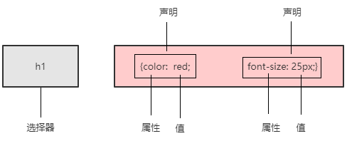
3.1.1 CSS规则
3.1.2 CSS代码风格(建议规范写法)
3.1.3 引入CSS的方式
(1)行内样式表(行内式)
<style></style>。控制当前html页面,理论上可以放在html的任何位置,一般放在<head></head>标签内
(2)内部样式表(嵌入式)
<div style=""></div>
(3)外部样式表(链接式)
<link rel="stylesheet" href="css文件路径">
3.1.4 CSS选择器分类
(1)标签选择器,标签名 {}
(2)类选择器,.类名 {}
①CSS class 命名规范
名称类
- 头:header
- 内容:content .container
- 尾:footer
- 导航:nav
- 侧栏:sidebar
- 栏目:column
- 页面外围布局:wrapper
- 左右中:left right center
- 登录条:loginbar
- 标志:logo
- 广告:banner
- 页面主体:main
- 热点:hot
- 新闻:news
- 下载:download
- 子导航:subnav
- 菜单:menu
- 子菜单:submenu
- 搜索:search
- 友情链接:friendlink
- 页脚:footer
- 版权:copyright
- 滚动:scroll
- 内容:content
- 标签页:tab
- 文章列表:list
- 提示信息:msg
- 小技巧:tips
- 栏目标题:title
- 加入:joinus
- 指南:guild
- 服务:service
- 注册:regsiter
- 状态:status
- 投票:vote
- 合作伙伴:partner
- 主要 master.css
- 模块 module.css
- 公用 base.css
- 布局 layout.css
- 主题 themes.css
- 专栏 columns.css
- 文字 font.css
- 图标 icon.css
- 表单 forms.css
- 补丁 mend.css
- 打印 print.css
- 导航菜单:nav-menu
- 轮播图:carousel
- 模式视图:modal
- 按钮:btn
- 下拉菜单:dropdown-menu
- 分页导航:pagination
- 工具提示:tooltips
- 分享工具:share
- 提示窗口:alert
- 进度条:progress-bar
- 用户头像:avtar
- 卡片:card
- 面板:panel
- 图片:img
View Code②多类名
<head>
    <!--字符编码-->
    <meta charset="UTF-8">
    <meta name="viewport" content="width=device-width, initial-scale=1.0">
    <title>Document</title>
    <style>
        .box {
            width: 100px;
            height: 100px;
        }
        .color-green{
            background-color: seagreen;
        }
        .color-red{
            background-color:darkred;
        }
        .color-blue{
            background-color: blue;
        }
    </style>
</head>
<body>
    <div class="box color-green"></div>
    <div class="box color-red"></div>
    <div class="box color-blue"></div>
</body>
View Code
(3)id选择器, #id {}
id是唯一的,只能被调用一次。
(4)通配符选择器 * {}
设置所有标签样式
3.1.5 CSS复合选择器
(1)后代选择器
ol li{}
ol li a{}
(2)子选择器
.nav>a{}
(3)并集选择器(建议竖着写)
div,
p{}
(4)伪类选择器
冒号
链接伪类选择器
a:link 选择所有未被访问的链接
a:visited 选择已经被访问的链接
a:hover 选择指针位于其上的链接
a:active 选择活动链接(鼠标按下未被弹起的链接)
为了确保生效,按照上面的顺序依次设置 link,visted,hover,active
:focus伪类选择器
用于选取获得焦点的表单元素
input:focus{}
3.1.6 元素显示模式
html元素分为块元素和行内元素
(1)块元素
常见的有h1~h6,p,div,ul,ol,li
特点:
·自己独占一行
·宽高,外边距以及内边距可以控制
·宽度默认是容器(父级宽)的100%
·是一个容器及盒子,里面可以放行内或块级元素
注意事项:
·文字类的元素不能使用块级元素
·p标签主要用于存放文字,因此p里面不能放块级元素,特别不能放<div>
·同理,h1~h6等都是文字类块级标签,里面也不能放其他块级元素
(2)行内元素
常见的有a,strong,em,i,span等
特点
·相邻行内元素显示在一行
·高,宽设置无效
·默认宽度是其内容的宽度
·行内元素只能容纳文本或其他行内元素
注意事项:
·链接里不能放链接
·<a>可以放块级元素
(3)行内块元素
<img> <input> <td>
特点:
·和相邻行内元素(行内块)在一行上,但是他们之间会有空白间隙。一行可以显示多个(行内元素特点)
·默认宽度就是它本身内容的宽度(行内元素特点)
·高度,行高,外边距和内边距都可以控制(块级元素特点)
(4)显示模式的转换
·转换为块元素:display:block
·转换为行内元素:display:inline
·转换为行内块元素:display:inline-block
3.1.7 CSS三大特性:层叠性,继承性,优先级
层叠性
相同选择器设置相同的样式,样式冲突,就近原则(覆盖)
继承性
子标签教程父标签的某些样式;
子元素可以继承父元素的样式(text-,font,line-这些元素开头的可以继承,以及color属性)
行高继承
body{font:12px/1.5 "微软雅黑"} ->1.5行高,当前元素文字大小font-size的1.5倍
优先级
·选择器相同,执行层叠性
·选择器不同,根据权重
*<元素<类<id<行内样式style<!important
div{color:pink!important;}
继承的样式权重为0
<head>
    <!--字符编码-->
    <meta charset="UTF-8">
    <meta name="viewport" content="width=device-width, initial-scale=1.0">
    <title>Document</title>
    <style>
        #color{
            color: blue;
        }
        p{
            color: red;
        }
    </style>
</head>
<body>
<div id="color">
    <p>color</p>
</div>
</body>
权重叠加:如果是复合选择器,则会有权重叠加,需要计算权重
各类选择器权重如下:
|
选择器
|
选择器权重
|
|
继承 或者*
|
0,0,0,0
|
|
元素选择器
|
0,0,0,1
|
|
类选择器,伪类选择器
|
0,0,1,0
|
|
id选择器
|
0,1,0,0
|
|
行内样式style=””
|
1,0,0,0
|
|
!important重要的
|
∞无穷大
|
权重虽然会叠加,但是永远不会有进位
实例
css:
<style>
        .nav li{
            color: orange;
        }
        ul li{
            color: red;
        }
        li{
            color: blue;
        }
    </style>
View Code
html
<ul class="nav">
    <li>1</li>
    <li>2</li>
    <li>3</li>
    <li>4</li>
    <li>5</li>
</ul>
View Code
最后文字显示为橘色,因为 .nav li的叠加权重为0,0,1,0+0,0,0,1=0,0,1,1最大
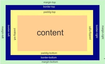
3.1.8 盒子模型(Box Model)
页面布局学习的三大核心:盒子模型、浮动、定位
看透网页布局的本质
网页布局过程:
(1)先准备好相关的网页元素,网页元素基本都是盒子Box
(2)利用CSS设置好盒子样式,然后摆放到相应位置
(3)往盒子里面装内容
网页布局的核心本质:就是利用CSS摆盒子
盒子模型的组成
所谓盒子模型:就是把HTML页面中的布局元素看作是一个矩形的盒子,也就是一个盛装内容的容器。
CSS盒子模型本质上是一个盒子,封装周围的HTML元素,它包括:边框border、外边距margin、内边距padding、和实际内容
content
border
border : border-width | border-style | border-color
border-style:solid /dashed /dotted
border-top/bottom/left/right
表格细边框/合并相邻边框
border-collapse:collapse;
边框影响盒子大小
width+border-width*2
padding
padding-top/bottom/right/left
padding:上右下左/上(左右)下/上下(左右)
padding影响盒子大小:如果盒子设置了width/height会撑大盒子
margin
margin-top/bottom/rignt/left
简写方式与padding一样
块级盒子水平居中的条件:
·盒子指定了宽度
·盒子左右外边距设置为auto
·方法
margin-left:auto;margin-right:auto;
margin:auto;
margin:0 auto;
行内元素/行内块元素水平居中
给其父元素添加text-align:center
嵌套块元素垂直外边距的塌陷
对于两个嵌套关系(父子关系)的块元素,父元素有上外边距同时子元素也有上外边距,此时父元素会塌陷较大的外边距值。
<head>
    <meta charset="UTF-8">
    <meta name="viewport" content="width=device-width, initial-scale=1.0">
    <title>Document</title>
    <style>
       .father{
           width:300px;
           height: 300px;
           margin-top: 20px;
           background-color: grey;
       }
       .son{
           width: 150px;
           height: 150px;
           margin-top: 10px;
           background-color: orange;
       }
    </style>
</head>
<body>
<div class="father">
    <div class="son"></div>
</div>
</body>
View Code
解决方案∶
可以为父元素定义上边框。
可以为父元素定义上内边距。
可以为父元素添加overflow:hidden;
还有其他方法,比如浮动、固定,绝对定位的盒子不会有塌陷问题
清除内外边距
* {
padding: 0;
margin: 0;
}
注意︰行内元素为了照顾兼容性,尽量只设置左右内外边距,不要设置上下内外边距。但是转换为块级和行内块元素就可以了
盒子阴影 (box-shadow)
<head>
    <!--字符编码-->
    <meta charset="UTF-8">
    <meta name="viewport" content="width=device-width, initial-scale=1.0">
    <title>Document</title>
    <style>
        div {
            width: 200px;
            height:200px;
            margin: 100px auto;
            background-color: orange;
            /* box-shadow: 10px 10px 10px -4px rgba(0, 1, 1, .3); */
        }
        div:hover {
            box-shadow: 10px 10px 10px -4px rgba(0, 1, 1, .3);
        }
    </style>
</head>
<body>
    <div>
    </div>
</body>
View Code
文字阴影(text-shadow)
<div style="font-size: 50px;color: orange;text-shadow: 5px 5px 5px rgba(0,0,0,0.3); ">shadow</div>
View Code
shadow
3.2浮动
3.2.1概述
传统网页布局的三种方式
·普通流(标准流)
·浮动
·定位
其中普通流布局即标签按照规定好默认方式排列:
1.块级元素会独占一行,从上向下倾序排列。
常用元素:div、hr、p、h1~h6、ul、ol、dl、form、table
2.行内元素会按照顺序,从左到右顺序排列,碰到父元素边缘则自动换行。
常用元素:span、a、 i、em等
以上都是标准流布局,我们前面学习的就是标准流,标准流是最基本的布局方式。
这三种布局方式都是用来摆放盒子的,盒子摆放到合适位置,布局自然就完成了。
注意∶实际开发中,一个页面基本都包含了这三种布局方式(后面移动端学习新的布局方式)。
为什么需要浮动?
有很多的布局效果,标准流没有办法完成,此时就可以利用浮动完成布局。因为浮动可以改变元素标
签默认的排列方式。
浮动最典型的应用:可以让多个块级元素一行内排列显示。
网页布局第一准则:多个块级元素纵向排列找标准流,多个块级元素横向排列找浮动。
是什么是浮动?
float属性用于创建浮动框,将其移动到一边,直到左边缘或右边缘触及包含块或另一个浮动框的边缘。
float:none/left/right
3.2.2浮动特性
加了浮动之后的元素,会具有很多特性,需要我们学握的
(1)浮动元素会脱离标准流(脱标)
①脱离标准普通流的控制(浮)移动到指定位置(动),(俗称脱标)
②浮动的盒子不再保留原先的位置
<style>
        .box1 {
            width: 200px;
            height: 200px;
            background-color: rgba(120, 120, 120, 0.5);
            float: left;
        }
        .box2 {
            width: 150px;
            height: 150px;
            background-color: purple;
        }
</style>
View Code
(2)浮动的元素会一行内显示并且元素顶部对齐
注意:浮动的元素是互相贴靠在一起的(不会有缝隙),如果父级宽度装不下这些浮动的盒子,多出的盒子
会另起一行对齐。
div {float:left}
(3)浮动的元素会具有行内块元素的特性
任何元素都可以浮动。不管原先是什么模式的元素,添加浮动之后具有行内块元素相似的特性。如果行内元素有了浮动,则不需要转换块级/行内块元素就可以直接给高度和宽度。
·如果块级盒子没有设置宽度,默认宽度和父级一样宽,但是添加浮动后,它的大小根据内容来决定
·浮动的盒子中间是没有缝隙的,是紧挨着一起的
·行内元素同理
3.2.3 浮动元素经常和标准流父级搭配使用
为了约束浮动元素位置,我们网页布局一般采取的策略是:
先用标准流的父元素排列上下位置,之后内部子元素采取浮动排列左右位置,符合网页布局第一准则
练习1
练习2
练习3
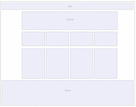
3.2.4 常见网页布局
3.2.5浮动布局注意点
(1)浮动和标准流的父盒子搭配
先用标准流的父元素排列上下位置,之后内部子元素采取浮动排列左右位置
(2)一个元素浮动了,理论上其余的兄弟元素也要浮动
一个盒子里面有多个子盒子,如果其中一个盒子浮动了,那么其他兄弟也应该浮动,以防止引起问题。
浮动的盒子只会影响浮动盒子后面的标准流不会影响前面的标准流。
3.2.6 清除浮动
为什么要清除浮动
在不适合设置父盒子的场景,需要让子盒子撑开父盒,但是如果父盒子未设置高度,父盒子高度会自动变为0。这样与父盒子同级的标准流盒子,会跑上来,占有父盒子的位置。
清除浮动的本质
清除浮动的本质是清除浮动元素脱离标准流造成的影响,如果父盒子本身有高度,则不需要清除浮动。清除浮动之后,父级就会根据浮动的子盒自动检测高度。父级有了高度,就不会影响下面的标准流了。
清除浮动的策略是:闭合浮动
clear:left/right/both
清除浮动的方法
(1)额外标签法也称为隔墙法,是W3C推荐的做法。
额外标签法会在浮动元素末尾添加一个空的标签。例如<div style="clear:both”></div>,或者其他标签
(如<br/>等)。
优点︰通俗易懂,书写方便
缺点:添加许多无意义的标签,结构化较差
注意︰要求这个新的空标签必须是块级元素。
(2)父级添加overflow属性
可以给父级添加overflow属性,将其属性值设置为hidden、auto或scroll。
优点:代码简洁
缺点:无法显示溢出的部分
(3)父级添加after伪元素
:after方式是额外标签法的升级版。也是给父元素添加
.clearfix:after {
            content : "";
            display: block;
            height: 0;
            clear: both;
            visibility: hidden;
            }
.clearfix {/* IE6、7专有 */
            *zoom: 1;
        }
优点:没有增加标签,结构更简单
缺点︰照顾低版本浏览器
(4)父级添加双伪元素
给父元素添加:
.clearfix:before,.clearfix:after {
            content:"";
            display:table;
        }
        .clearfix:after {
            clear:both;
        }
        .clearfix {
            *zoom: 1;
        }
优点:代码更简洁
缺点:照顾低版本浏览器
3.2.7 CSS属性书写顺序
建议遵循以下顺序:
1.布局定位属性:display / position / float / clear / visibility / overflow(建议display第一个写,毕竟关系到模式)
2.自身属性: width / height / margin / padding / border / background
3.文本属性:color / font / text-decoration / text-align / vertical-align / white-space / break-word
4.其他属性(CSS3) : content /cursor / border-radius/ box-shadow / text-shadow / background:linear-gradient..
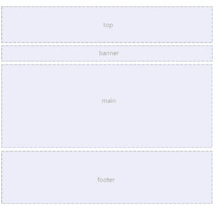
3.2.8 页面布局整体思路
为了提高网页制作的效率,布局时通常有以下的整体思路:
(1)必须确定页面的版心(可视区),我们测量可得知。
(2)分析页面中的行模块,以及每个行模块中的列模块。其是页面布局第一准则。
(3)一行中的列模块经常浮动布局,先确定每个列的大小之后确定列的位置。页面布局第二准则。
(4)制作HTML结构。我们还是遵循,先有结构,后有样式的原则。结构永远最重要。
(5)所以,先理清楚布局结构,再写代码尤为重要.这需要我们多写多积累。
3.3 常用属性
设置字体
font-family: 'Gill Sans', 'Gill Sans MT', Calibri, 'Trebuchet MS', sans-serif;
可设置多种字体,寻找浏览器支持字体,优点使用前面的字体。谷歌默认字体为微软雅黑。
设置字体大小
font-size,谷歌默认为16px,因为不同浏览器默认大小不一样,最好设置一下大小。
字体粗细
font-weight:400/normal/700/blod/100-900
字体样式
font-style
normal/italic
font复合属性/字体复合属性
font:font-style font-weght font-size/line-height font-family
h1 {
            font:bold normal 20px "宋体";
        }
文本颜色
color:red;
color:#ff0000;
color:rgb(255,0,0)
文本对齐/对齐文本
text-align:left/center/right 水平对齐方式
文本装饰/装饰文本
text-decoration:none/underline/overline/line-throught
a {
            text-decoration: none;
        }
文本缩进
text-indent:10px/2em 针对首行缩进
行间距
line-height:26px;
单行文字垂直居中
设置行高line-height为盒子高度
行高可以继承,父元素设置了行高,会继承给子元素
背景颜色
background-color:transparent(默认透明)
背景图片
background-image:none|url(url)
背景图片平铺
background-repeat:repeat|no-repeat|repeat-x|repeat-y
背景位置
background-position:x y;
(1)可以设置方位名词,top|center|botton|left...
设置两个方位名词 right center和center right效果是等价的,与顺序无关;也可以只设置一个方位名词,另一个默认是center
(2)设置为精确单位
background-position: 20px 50px
(3)使用混合单位
background-postion:20px center
背景固定
background-attachment:scroll/fixed
设置背景图像是否固定或者随着页面其余部分滚动,默认为滚动
背景属性复合写法
background,没有顺序要求
背景色半透明/背景透明
background:rgba(0,0,0,.3)
4.HTML标签(用于查询ctrl+f)
页面标题
title
分级标题
h1-h6
线
hr
段落
p
换行
<br />
加粗
strong/b
倾斜
em/i
<div>
        <em style="font-style: normal; color: orange;">|</em>
    </div>
View Code
|
删除线
del/s
下划线
ins/u
盒子
div:换行
span:不换行
图像/图片
<img src="pic/w.jpg" alt="w" title="model" width="400" border="3"/>
<img src="https://i.cnblogs.com/assets/adminlogo.gif" alt="w" title="model" width="400" border="3"/>
超链接
<a href="https://www.cnblogs.com/vocus/" target="_blank">vocus's blog</a>
<a href="https://www.cnblogs.com/vocus/" target="_self">vocus's blog</a>
<a href="https://files.cnblogs.com/files/vocus/json-lib-2.4&dependencies_jars.rar" target="_self">download</a>
锚点跳转
<a href="#two">跳转</a>
<h6 id="two">跳转到这里...</h6>
测试:概述
注释
<!--注释-->
特殊字符/字符实体
https://www.w3school.com.cn/html/html_entities.asp
表格
<table align="center" width="560" cellpadding="2" border="1" cellspacing="0">
        <tr>
            <th>Aug 2020</th>
            <th>Aug 2019</th>
            <th>Change</th>
            <th>Programming Language</th>
            <th>Ratings</th>
        </tr>
        <tr>
            <td>1</td>
            <td>2</td>
            <td><img src="https://img2020.cnblogs.com/blog/1744377/202009/1744377-20200915024547571-1882374707.png"/></td>
            <td>C</td>
            <td>16.98%</td>
        </tr>
        <tr>
            <td>2</td>
            <td>1</td>
            <td><img src="https://img2020.cnblogs.com/blog/1744377/202009/1744377-20200915024557994-447955880.png"/></td>
            <td>Java</td>
            <td>14.43%</td>
        </tr>
        <tr>
            <td>3</td>
            <td>3</td>
            <td></td>
            <td>Python</td>
            <td>9.69%</td>
        </tr>
    </table>
View Code
表格结构标签
thead:头部区域
tbody:主体区域
<table><thead><tr><th></th></tr></thead><tbody><tr><td></td></tr></tbody></table>
合并单元格
跨行合并;rowspan
扩列合并:colspan
<table border="1" cellspacing="0" width="400" height="400">
        <tr>
            <td>1</td>
            <td>2</td>
            <td rowspan="2">3</td>
        </tr>
        <tr>
            <td colspan="2">4</td>
        </tr>
        <tr>
            <td>5</td>
            <td>6</td>
            <td>7</td>
        </tr>
    </table>
View Code
无序列表
<ul><li>
去掉导航圆点:
li{list-style:none}
有序列表
<ol><li>
自定义列表
<dl><dt></dt><dd></dd><dd></dd></dl>
<dl>
        <dt>分类</dt>
        <dd>子类1</dd>
        <dd>子类2</dd>
        <dd>子类3</dd>
    </dl>
View Code
表单
https://www.w3school.com.cn/tags/tag_input.asp
表单域,表单控件,提示信息
<form action=url method="post/get" name="">
输入框,name(用于区别不同的表单元素),value,maxlength(最大输入字符)
<input type="text"/>
密码框,name,value
<input type="text"/>
单选按钮,name值相同才能实现多选一,value,checked
<input type="radio"/>
复选按钮,name值一样,后台判断选择的是哪一个,value,checked
<input type="checkbox"/>
提交按钮
<input type="submit" value="提交">
重置按钮
<input type="reset" value="重置">
按钮
<input type="reset" value="按钮">
文件上传
<input type="file">
label标签
将label的for属性与元素的id属性设置为相同的值,实现文本和表单元素绑定
<label for="man">男</label><input type="radio" id="man"/>(点击文字,选中单选按钮)
下拉框/下拉表单元素,selected="selected"
<select><option>
文本域
<textarea rows="" cols=""
表单的例子
<h4>青春不常在,抓紧谈恋爱</h4>
    <form>
        <table>
            <tr>
                <td>性别</td>
                <td><label for="man">男</label><input type="radio" id="man"/><label for="man">女</label><input type="radio" id="woman"/></td>
            </tr>
            <tr>
                <td>生日</td>
                <td>
                    <select>
                        <option selected="selected">--选择年份--</option>
                        <option>2010</option>
                        <option>2011</option>
                        <option>2012</option>
                    </select>
                    <select>
                        <option selected="selected">--选择月份--</option>
                        <option>1</option>
                        <option>2</option>
                        <option>3</option>
                    </select>
                    <select>
                        <option selected="selected">--选择日期--</option>
                        <option>11</option>
                        <option>12</option>
                        <option>13</option>
                    </select>
                </td>
            </tr>
            <tr>
                <td>选择婚姻状况:</td>
                <td><input type="checkbox" name="marry" id="yihun"><label for="yihun">已婚</label><input type="checkbox" checked="checked" name="marry" id="weihun"><label for="weihun">未婚</label><input type="checkbox"  name="marry" id="liyi"><label for="liyi">离异</label></td>
            </tr>
            <tr>
                <td>学历:</td>
                <td><input type="text" value="幼儿园"/></td>
            </tr>
            <tr>
                <td>喜欢的类型</td>
                <td><input type="checkbox" id="wumei" checked><label for="wumei">妩媚的</label><input type="checkbox" id="keai"><label for="keai">可爱的</label><input type="checkbox" id="xiaoxianrou"><label for="xiaoxianrou">小鲜肉</label><input type="checkbox" id="laolarou"><label for="laolarou">老腊肉</label><input type="checkbox" id="douxihuan"><label for="douxihuan">都喜欢</label></td>
            </tr>
            <tr>
                <td>自我介绍</td>
                <td><textarea>介绍自己</textarea></td>
            </tr>
            <tr>
                <td></td>
                <td><input type="checkbox" checked/>我同意注册条款</td>
            </tr>
            <tr>
                <td></td>
                <td><input type="submit" value="注册"/></td>
            </tr>
            <tr>
                <td></td>
                <td><a href="#">我已是会员,直接登录</a></td>
            </tr>
        </table>
    </form>
View Code
来源:https://www.cnblogs.com/vocus/p/13670467.html |


 發表於 2020-9-17 05:37:00