CSS详解
1、什么是CSS
2、选择器
2.1、基本选择器
-
标签选择器
直接将元素标签放在style中,(少用)
-
类选择器 class
class 选择器用于描述一组元素的样式,class 选择器有别于id选择器,class可以在多个元素中使用。
class 选择器在HTML中以class属性表示, 在 CSS 中,类选择器以一个点"."号显示:
.center {text-align:center;}
-
ID选择器
id 选择器可以为标有特定 id 的 HTML 元素指定特定的样式。
HTML元素以id属性来设置id选择器,CSS 中 id 选择器以 "#" 来定义。
 #para1 {
     text-align:center;
     color:red;
     }
2.2、层次选择器
-
后代选择器
在某个元素的后面,包含在上一级标签中的所有标签
ul中li标签的背景颜色都变为红色
-
子选择器
只有一代,指定子代同级标签中的一个
且只有子代的p标签会变色,p标签后ul,li标签不会变色
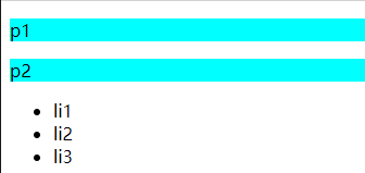
body>p{
background: aqua;
}
</style>
</head>
<body>
<p>p1</p>
<p>p2</p>
<p><ul>
<li>li1</li>
<li>li2</li>
<li>li3</li>
</ul>
</p>
</body>
2.3、结构伪类选择器
伪类:给标签加上条件,然后选中
<!DOCTYPE html>
<html lang="en">
<head>
<meta charset="UTF-8">
<title>Title</title>
<style>
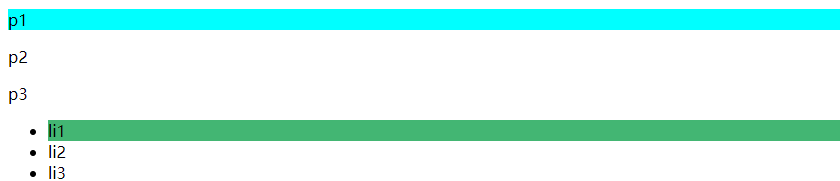
/*选中ul的第一个子元素*/
ul li:first-child{
background: #43b673;
}
/*选中p的第一个元素
nth-child(1):选中当前标签父元素的第一个子元素,
并且是当前类型标签才生效!
*/
p:nth-child(1){
background: aqua;
}
</style>
</head>
<body>
<p>p1</p>
<p>p2</p>
<p>p3</p>
<ul>
<li>li1</li>
<li>li2</li>
<li>li3</li>
</ul>
</body>
</html>
2.4、属性选择器(重要)
基本类似于id+class
<!DOCTYPE html>
<html lang="en">
<head>
<meta charset="UTF-8">
<title>Title</title>
<style>
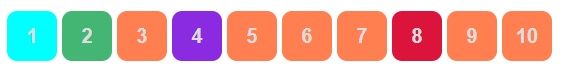
.demo a{
float: left;
display: block;
height: 50px;
width: 50px;
border-radius: 10px;
background: #43b673;
text-align: center;
color: gainsboro;
text-decoration: none;
margin-right: 5px;
font:bold 20px/50px Arial;
}
/*利用属性名选择标签,属性名 = 属性值(正则)
 *=  包含等号右边
 ^=  以等号右边开头
 $=  以等号右边结尾
*/
/*存在id属性的元素 a[]{}*/
a[id]{
background: aqua;
}
/*也可以具体到某个id*/
a[id=qwe]{
background: blueviolet;
}
/*选中class是links的元素 */
a[class *= "links"]{
background: coral;
}
/*选中href中以http开头的元素 */
a[href^=http]{
background: crimson;
}
</style>
</head>
<body>
<p class="demo">
<a href="/abc.pdf" class=" item first" id="first">1</a>
<a href="" class="item active" target="_blank" title="test">2</a>
<a href="image/123.html" class="links item">3</a>
<a href="image/123.png" id="qwe">4</a>
<a href="image/123.jpg" class="links item">5</a>
<a href="abc" class="links item">6</a>
<a href="/a.pdf" class="links item">7</a>
<a href="http://www.baidu.com" class="links item">8</a>
<a href="abc.word" class="links item">9</a>
<a href="abc.doc" class="links item last">10</a>
</p>
</body>
</html>
*= 包含等号右边
^= 以等号右边开头
$= 以等号右边结尾
3、美化网页元素
3.1、为什么要美化网页
-
有效的传递信息
-
吸引用户
-
凸显主题
-
提高用户体验
span标签:重点要突出的字
<!DOCTYPE html>
<html lang="en">
<head>
<meta charset="UTF-8">
<title>Title</title>
<style>
#ttd{
font-size: 50px;
}
</style>
</head>
<body>
欢迎学习<span id="ttd">Java</span>
</body>
</html>
3.2、字体样式
<!--
font-family: 字体
font-size: 字体大小
font-weight: 字体粗细
-->
<style>
body{
font-family: 幼圆 , "Bell MT";
}
h1{
font-size: 50px;
}
.p1{
font-weight: bold;
}
p{
color: #43b673;
}
</style>
3.3、文本样式
-
颜色 color RGB RGB( , , )
-
文本对齐方式 text-align=center
-
首行缩进 text-indent: 2em
-
行高 line-height
-
装饰 链接去下划线: text-decoration
-
文本图片水平对齐:vertical-align: middle
<!DOCTYPE html>
<html lang="en">
<head>
<meta charset="UTF-8">
<title>Title</title>
<!--
设置颜色:单词 RGB
排版: text-align:
首行缩进: text-indent:
行高和块的高度一样可以段落居中:height: 30px;
line-height: 30px;
-->
<style>
h1{
color: rosybrown;
text-align: center;
}
.p1{
text-indent: 2em;
}
.p3{
background: coral;
height: 30px;
line-height: 30px;
}
</style>
</head>
<body>
<h1>人物介绍</h1>
<P class="p1">
2015年,李子柒开始自拍自导古风美食短视频。 早期,她的视频虽然创意有余,却质量一般,比如《樱桃酒》。
</P >
<p>
而在拍摄内容的选择上,和奶奶生活在一起的李子柒选择了最熟悉的“农村生活”。其最初设定的话题取自俗语:“四季更替,适食而食”,后来在编辑的建议下改成了“古香古食”。期间,她曾用了一年多的时间还原“文房四宝”在古代的制作过程,也用古法制作过手工酱油,甚至以一人之力在院子里用木头和竹子搭了一座茅草棚和秋千架 [4] 。
</P>
<p class="p3">You make me feel so happy;Whenever I'm with you.You make me feel so special--This love is too good to be true.</p>
</body>
</html>
3.4、文本阴影和超链接伪类
超链接伪类,正常情况下 a:hover
<!DOCTYPE html>
<html lang="en">
<head>
<meta charset="UTF-8">
<title>Title</title>
<style>
/*默认的颜色*/
a{
text-decoration: none;
color: #000000;
}
/*鼠标悬浮状态(重要,只记hover)*/
a:hover{
color: coral;
font-size: 50px;
}
/*鼠标选中激活状态*/
a:active{
color: #43b673;
}
/*阴影*/
#price{
text-shadow: 0px 13px 1px #4f65a0;
}
</style>
</head>
<body>
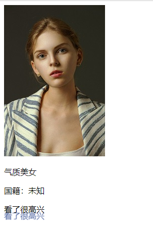
<a href="#">
<img src="aaa.jpg" alt="">
</a>
<p>
<a href="#">气质美女</a>
</p>
<p>
<a href="">国籍:未知</a>
</p>
<p id="price">
看了很高兴
</p>
</body>
</html>
3.5、列表样式
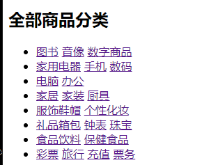
html页面原始样式:
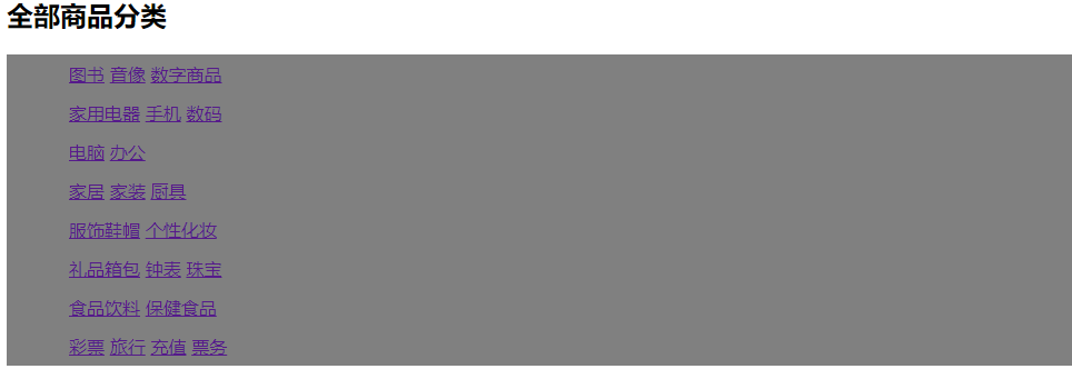
列表美化样式:
/*ul li*/
ul{
background: gray;
}
/*
list-style:none
none去掉无需列表的圆点
circle空心圆
decimal有序列表
*/
ul li{
line-height: 35px;
list-style: none;
text-indent: 1em;
}
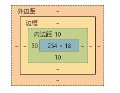
4、盒子模型
4.1、什么是盒子模型
margin : 外边距 border :边框 padding :内边距
4.2、边框
-
边框的粗细
-
边框的样式
-
边框的颜色
<style>
/*body等总有一个默认的外边距 ,常进行初始化*/
/*h1,h2,ul,li,a,body{*/
/* margin: 0px;*/
/* padding: 0px;*/
/* text-decoration: none;*/
/*}*/
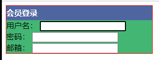
#box{
width: 300px;
border:1px solid red;
}
h2{
font-size: 16px;
background-color: #4f65a0;
line-height: 30px;
margin: 0px;
color: white;
}
form{
background: #43b673;
}
div:nth-of-type(1) input[id="a"]{
border: 2px solid black;
}
</style>
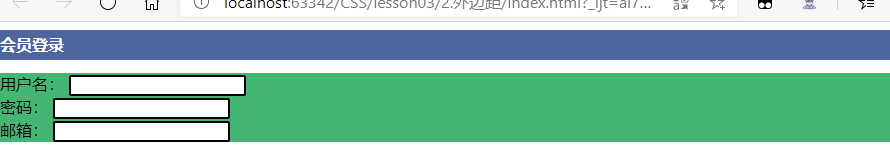
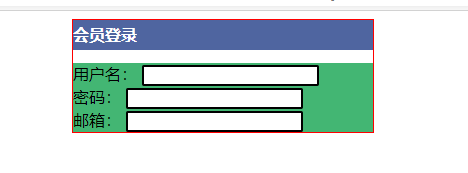
4.3、外边距
 /*外边距可以进行居中操作
  margin: 0 auto;
 */
         #box{
             width: 300px;
             border:1px solid red;
             margin: 0 auto;
         }
居中前:
居中后:
盒子的就算方式:margin+border+padding+内容宽度
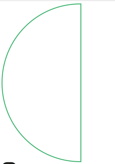
4.4、圆角边框
4个角
 <!--  border-radius:  角的圆的程度
       值的数量对应角的位置
       四个值:左上  右上   右下   左下 (顺时针)
       两个值:左上+右下    右上+左下
       圆:   圆角=宽度=高度
 -->
   <style>
       div{
           width: 250px;
           height: 500px;
           border: 3px #43b673 solid;
           border-radius: 500px 0  0 500px;
       }
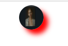
4.5、盒子阴影
img{
     width: 50px;
     height: 50px;
     border-radius: 25px;
     box-shadow: 10px 10px 10px red;
     }
5、浮动
5.1、标准文档流
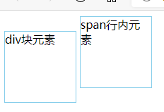
块级元素:独占一行
h1~h6 p div 列表...
行内元素:不独占一行,可以被包含在块级元素中
span a img strong...
5.2、display
/*dispplay:block;
 block ,块元素
 inline , 行内元素
 inline-block , 块元素,但可以内联,在一行
 none , 元素不显示
 */
 span{
     width: 100px;
     height: 100px;
     border: 1px solid skyblue;
     display: inline-block;
 }
5.3、左右浮动
float:left right ;
元素浮动,类似于行内元素那样的样式在一行,可以控制方向
清除浮动,恢复块元素的样式
5.4、父级边框塌陷
解决方法:
-
增加父级元素高度
 #father{
     border:1px blue solid;
     height:800px;
 }
-
增加一个空的的div标签,清除浮动
<div class="clear"></div>
.clear{
clear:both;
margin=0;
padding:0;
}
-
overflow
overflow:hidden; //在父级元素中增加一个
这个属性定义溢出元素内容区的内容会如何处理。如果值为 scroll,不论是否需要,用户代理都会提供一种滚动机制。因此,有可能即使元素框中可以放下所有内容也会出现滚动条。
-
父类添加一个伪类(推荐)
#father:after{
     content:'';
     display:block;
     clear:both;
 }
6、定位
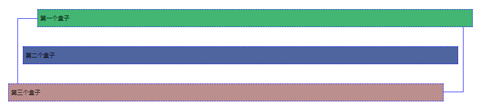
6.1、相对定位
<!DOCTYPE html>
<html lang="en">
<head>
<meta charset="UTF-8">
<title>Title</title>
<!-- 相对定位
相对于自己原来的位置进行偏移
-->
<style>
body{
padding: 20px;
}
div{
margin: 10px;
padding: 5px;
font-size: 12px;
line-height: 25px;
}
#father{
border: solid 1px blue;
padding: 0px;
}
#first{
background-color: #43b673;
border: dashed 1px blue;
position: relative; /*相对定位:向自己原来位置的上下左右移动*/
top:-30px;
left: 30px;
}
#second{
background-color: #4f65a0;
border: dashed 1px blue;
}
#third{
background-color: rosybrown;
border: dashed 1px blue;
position: relative;
bottom: -30px;
right: 30px;
}
</style>
</head>
<body>
<div id="father">
<div id="first">第一个盒子</div>
<div id="second">第二个盒子</div>
<div id="third">第三个盒子</div>
</div>
</body>
</html>
相对定位: position: relative;
/相对定位:向自己原来位置的上下左右移动/ ,
但元素原来盒子位置仍然保留,仍在标准文档流中
top right bottom left 顺时针
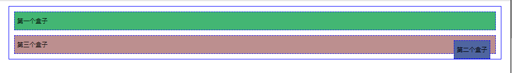
6.1、绝对定位
定位: 基于xxx定位,上下左右移动
position: absolute;
-
没有父级元素定位的情况下,相对于浏览器边框定位
-
假设父级元素存在定位,通常相对于父级元素进行偏移
-
在父级元素范围内移动
元素原来盒子位置不保留,不在标准文档流中
 #second{
             border: dashed 1px blue;
             position: absolute;
             right: 30px;
         }
6.3、固定定位fixed
<!DOCTYPE html>
<html lang="en">
<head>
<meta charset="UTF-8">
<title>Title</title>
<style>
body{
height: 1000px;
}
div:nth-of-type(1){ /*绝对定位:相对于浏览器*/
width: 100px;
height: 100px;
background: red;
position: absolute;
right: 0;
bottom: 0;
}
div:nth-of-type(2){ /*fixed固定定位,固定在一个位置不变*/
width: 50px;
height: 50px;
background: yellow;
position: fixed;
right: 0;
bottom: 0;
}
</style>
</head>
<body>
<div>div1</div>
<div>div2</div>
</body>
</html>
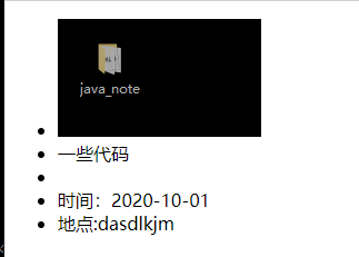
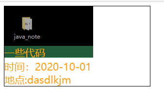
6.4、z-index
z-index简单类比千层饼,浏览器的页面就是盘子,页面上的盒子就是摞起来的饼层。
给不同的盒子赋予不同的层级,高层级显示在底层级之上。
z值就是层数值。
<!DOCTYPE html>
<html lang="en">
<head>
<meta charset="UTF-8">
<title>Title</title>
<link rel="stylesheet" href="css/style.css">
</head>
<body>
<div id="content">
<ul>
<li><img src="images/bg.png" alt=""></li>
<li class="tipText">一些代码</li>
<li class="tipBg"></li>
<li>时间:2020-10-01</li>
<li>地点:dasdlkjm</li>
</ul>
</div>
</body>
</html>
 #content{
     width: 300px;
     padding: 0px;
     margin: 0px;
     overflow: hidden;
     font-size: 21px;
     border: 1px #000 solid;
 }
 ul,li{
     padding: 0px;
     margin: 0px;
     list-style: none;
     color: orange;
 }
 /*父级元素相对定位,子级绝对定位*/
 #content ul{
     position: relative;
 }
 .tipText,.tipBg{
     position: absolute;
     width: 183px;
     height: 25px;
     top: 82px;
 }
 /*设置层级让字显示在绿色背景之上*/
 .tipText{
     z-index: 3;
 }
 /*opacity 调整背景透明度*/
 .tipBg{
     background: #43b673;
     opacity: 0.5;
 }
前:
后:
来源:https://www.cnblogs.com/juvenileblogs/p/13775862.html |


 發表於 2020-10-6 22:51:00